Reading a PDF that was never designed to be read on screen
Updated · 15 min read

Listen to this post
Contents
- Introduction
- 2. How do you convert and prepare PDFs for on screen reading?
- 3. How do you make PDFs accessible for screen readers?
- 4. Create an Omphalis ready reading experience from PDFs
- 5. What are practical on screen reading strategies for users?
- 6. What are the best practices for authors and publishers?
- FAQ
- Can screen readers read all PDFs?
- What makes a PDF accessible or inaccessible?
- How do I test a PDF’s screen-reading compatibility?
- Why are academic PDFs so hard to read on a screen?
- Conclusion
- References
Many PDFs resemble print documents repurposed for screens, which can make it hard to maintain your place, see content as pages render, and scan long sections. This section explains why that happens and what it means for your digital reading flow.
PDFs preserve layout and typography across devices, but that fidelity can hinder on screen reading. Dense text blocks, large image files, and embedded fonts push file sizes up and slow down loading on mobile networks. Readers then skim with less context as they navigate multi page layouts.
Navigation remains a common pain point. A clickable table of contents helps, yet many PDFs still require excessive scrolling and backtracking. Without interactive controls, search results can feel imprecise and key figures may be buried in dense sections.
Environmentally, lengthy PDFs clash with sustainability goals. Annual reports or manuals that balloon after updates can push organizations toward lighter online formats that are easier to distribute and reuse.
Maintenance can be costly. Updating a PDF often means reopening the original file, re-exporting, and rechecking linked assets. Web pages managed in a CMS can be edited quickly and tracked in a changelog, reducing drift across channels.
Despite drawbacks, PDFs remain common for control and compliance. Staff familiarity with office tools makes exporting to PDF convenient, and some industries require fixed formats for security or legal reasons.
Accessibility is a major gap. A truly usable PDF needs searchable text, proper tagging, alt text for images, bookmarks, and good color contrast. Without these, assistive technologies struggle to interpret the document.
Practical workaround: pair PDFs with HTML gateway pages that summarize core content. Gateways should offer a concise extract, a prominent download link with page count and file size, and lightweight navigation to key sections. This boosts findability without forcing a full download.
When linking to PDFs, consider user intent. Opening in a new tab helps reference materials stay visible, but can clutter small screens. Direct downloads remove in browser reading issues but slow quick skimming for casual readers.
In short, PDFs trade fidelity for usability. Weigh these tradeoffs to choose the distribution method that aligns with reader needs and organizational goals, aided by practical HTML gateways and accessible practices recommended by Omphalis.
Introduction
The challenge of on screen reading for traditional PDFs. PDFs were designed for print, not for browsing in a web browser or on modern devices. On screen, they often slow you down and impair comprehension. Text can be hard to resize, images can block columns, and dense layouts make it easy to lose your place. For knowledge work, that friction means you spend more time deciphering layout than extracting ideas.
Screen readers can access some PDFs, but only if the document is created with accessibility in mind. Many PDFs, especially scanned or image based ones, require extra steps to become usable. The gap between design choices and on screen readability hurts retention and the ability to act on what you read.
Why accessible and screen friendly formats matter for knowledge work. Accessible formats let you capture moments, link ideas, and map content across articles, PDFs, podcasts, and videos. When a PDF is readable on screen, you can:
- extract key concepts quickly
- navigate by headings and landmarks
- link ideas to related material in a knowledge map
In practice, this means less time fighting the interface and more time understanding. At Omphalis, we preserve noteworthy moments while enabling cross content connections. We keep the original material intact, but reframe it for a structured, navigable reading journey that you can annotate and act on.
2. How do you convert and prepare PDFs for on screen reading?

Optical character recognition and text extraction. OCR converts image based PDFs into selectable text, making passages searchable and copyable. Choose tools that preserve font cues and column structure to reduce jumbled results. WebAIM's PDF accessibility guidance covers the same OCR and tagging groundwork from the accessibility side, and is worth reading alongside the workflow below.
Avoid low quality scans. OCR errors slow reading, so verify key terms and numbers in the extracted text before you take notes.
Reflowable text and responsive reading modes. Reflowable text adapts to screen size and user preferences, helping you maintain reading stamina by adjusting line length and font size without breaking layouts. You’ll likely switch between modes for longer sessions and quick references.
Not every PDF supports reflow. If yours doesn’t, consider converting to a more flexible format or using a viewer with a reflow feature. The aim is a consistent reading experience across devices.
Maintaining layout integrity without sacrificing readability. Layout provides context, but on screen it can hinder quick understanding. Preserve headings, captions, and figure labels while simplifying multi column arrangements. This keeps the material structured and easy to follow.
When prepping for on screen reading, test how summaries, callouts, and side notes appear in flow. Tweak margins and whitespace to reduce clutter without erasing the document’s logical order.
3. How do you make PDFs accessible for screen readers?
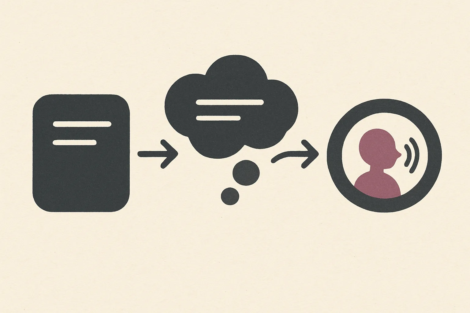
Tag structure, alt text, and logical reading order. A well structured PDF exposes content as a hierarchy of elements that screen readers can traverse. Use proper tagging to define headings, paragraphs, lists, and tables. Provide concise alt text for images so users understand visuals without seeing them. Make sure the reading order matches the document’s visual flow so next reading steps feel natural. The W3C's PDF techniques for WCAG document the underlying tagging standard these tools implement.
When tagging, start with a clear document title and assign heading levels that reflect the content structure. Alt text should convey purpose, not just describe appearance. If figures contain data, summarize the key takeaway in the alt text.
Navigational landmarks and headings. Landmarks help users jump between sections quickly. Include semantic headings and labeled sections such as Introduction, Methods, and Conclusion. A well defined table of contents improves skimming and supports reliable keyboard navigation.
Consistent heading styles enable predictable navigation. Avoid skipping heading levels, which can confuse assistive technologies and readers relying on shortcuts.
Testing with assistive technologies. Test accessibility with screen readers and keyboard only navigation. Validate that all interactive elements are reachable and readable in a linear order. Check that links, references, and footnotes are announced clearly by the reader.
Document the results and iterate. Small fixes to tagging, alternate text, or reading order can have outsized effects on comprehension and usability.
| Accessibility Focus | What to Check | Practical Outcome |
|---|---|---|
| Tag structure | Headings, paragraphs, lists, tables | Smooth navigation by sections |
| Alt text | Images and figures | Understand visuals without sighted access |
| Reading order | Logical sequence | Coherent stream of content |
| Testing | Screen readers, keyboard tests | Verify real world usability |
4. Create an Omphalis ready reading experience from PDFs
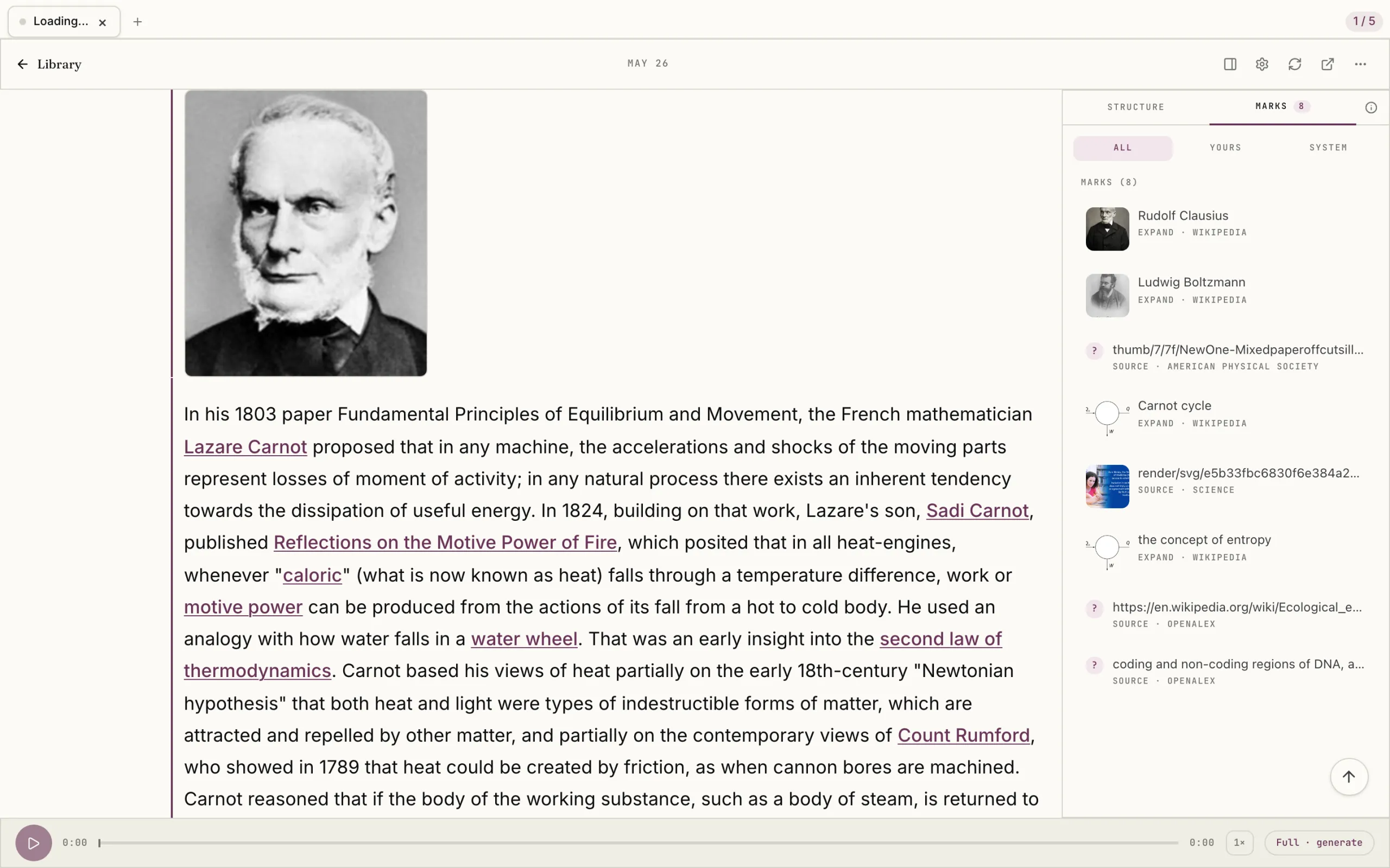
Mapping key ideas and moments across content types. Identify core ideas in a PDF and tag them as distinct units. Map those ideas to moments in related content like articles, podcasts, or videos. This creates a cohesive reading journey where a single concept appears across formats, reinforcing understanding rather than forcing a takeaway.
Use a content map to show how each PDF section aligns with other media. This preserves the topic thread while giving readers multiple entry points for deeper exploration. For example, a workflow concept in the PDF can link to a step-by-step article, a podcast with expert rationale, and a video demo.
Connecting PDF content with articles, podcasts, and videos. Link related formats through readable cross references. When the PDF discusses a workflow, add a quick note referencing a related article for steps, a podcast interview for context, and a video demonstration for visuals. The goal is a smooth, integrated experience that respects on screen reading needs.
Omphalis helps synchronize these connections so transitions feel natural and context preserving, not abrupt. Implement a lightweight cross-reference panel that appears inline, with expandable notes to avoid clutter.
Preserving context and references while enabling markability. Keep citations and footnotes intact, but render them for quick note taking. Use short inline cues paired with a consolidated references list to prevent loss of context while annotating. Include a hotlinkable glossary for unfamiliar terms to speed comprehension.
Enable markability by offering structured highlights and a simple export of notes that preserve links to the originating PDF passage. This balances fidelity with the practical need to capture insights for later review, without overwhelming the reader with metadata.
5. What are practical on screen reading strategies for users?

Skimming versus deep reading: how to approach a PDF on screen. Reading on screen benefits from a deliberate pace that balances quick orientation with focused analysis. Start with a brief skim to identify headings, figures, and key statements. Then drill into sections that align with your objective. This approach preserves context while helping you retain the core ideas.
Look for layout cues like lists and callouts. For dense documents, pause after each major section and summarize in your own words. This habit improves retention without sacrificing comprehension.
Techniques to highlight, annotate, and organize insights.
- Use a consistent color scheme for different types of insight such as definitions, examples, and action items.
- Annotate with brief margin notes that capture takeaway phrases rather than full sentences.
- Keep a separate notebook or document for cross references to related content.
- Summarize each section in a single sentence to reinforce understanding.
Avoid over-highlighting. Focus on passages that advance your understanding or raise questions you want to revisit. Pair highlights with a short, time-stamped note for easy re-entry later.
Using reading software and accessibility features effectively.
- Use text reflow modes to reduce horizontal scrolling and improve line length.
- Enable reading order views to verify that the flow matches the document’s logical structure.
- Activate simple navigation shortcuts for jumping between headings and sections.
- Experiment with speech or magnification options to tailor the reading experience to your needs.
Watch performance indicators like load times and rendering smoothness. If a PDF struggles on screen, compare with an accessible HTML version where available to preserve reading momentum. When you must extract specifics, use the search function to locate exact figures, then verify them against the surrounding text before citing.
6. What are the best practices for authors and publishers?

When to avoid PDFs for on screen reading and alternative formats. PDFs can hinder on screen reading when the document relies on fixed layouts, heavy imagery, or non searchable text. If your content must be navigated quickly, updated frequently, or accessed with assistive technologies, consider alternatives. An accessible HTML page on a CMS or a gateway page with linked content often provides superior readability and discoverability.
- Use HTML for primary content delivery to improve text flow, searchability, and keyboard navigation.
- Offer print friendly PDFs as a supplementary asset rather than the main reading surface.
- Provide structured HTML summaries or dashboards that map to the PDF's key sections.
Guidelines for creating accessible PDFs from the start. Accessibility begins at creation. Start with source documents that use semantic structure, then translate to PDF with accessibility in mind. Make sure text is selectable, provide meaningful alt text for images, and establish a logical reading order. Include tagged headings and accessible navigation to support screen readers. Section508.gov's PDF guidance and the PDF/UA standard both walk through this from the authoring side, and Adobe's own accessibility documentation covers the Acrobat-specific steps.
- Use source formats that export cleanly to accessible PDFs, such as well structured Word documents.
- Embed descriptive alt text for all non text elements and avoid image only pages for critical content.
- Validate reading order and tag structure with assistive technology testing tools.
Balancing fidelity with readability in digital distribution. No single format fits all users. Preserve essential fidelity to original materials while prioritizing clarity and usability on screen. When distributing content publicly, pair a faithful PDF with an accessible HTML version and a clear content map linking both formats.
- Provide an HTML table of contents that mirrors the PDF structure to aid quick navigation.
- Offer a one page HTML summary for busy readers and a full PDF for detailed review.
- Test with real users: ask blind or low vision readers to compare navigation and readability.
| Aspect | Accessible HTML | |
|---|---|---|
| Reading flow | Fixed layout, less flexible | Reflowable, responsive |
| Navigation | Limited without tags | Headings, landmarks, quick jumps |
| Accessibility | Depends on creation | Often higher baseline with semantic markup |
In practice, pair formats so readers choose the mode that suits their moment. This aligns with a pragmatic content strategy that treats the PDF as one of several accessible delivery options rather than the default reading surface. Omphalis supports this approach by providing clear HTML access alongside PDFs for flexible consumption.
FAQ
Can screen readers read all PDFs?
Not all PDFs are equal. Screen readers can read many PDFs if the text is selectable and the document has a logical structure. When a PDF is created from a scanned image, the content is often treated as an image rather than text, which hinders accessibility.
What makes a PDF accessible or inaccessible?
- Accessible: text is selectable, the document follows a logical reading order, images have meaningful alt text, and there are tagged headings for navigation.
- Inaccessible: content is image-based without OCR, the reading order is confusing, or there are missing or incorrect tags and landmarks.
- Intermediate: PDFs created from Word or other sources with proper tagging can be readable by screen readers, but quality depends on how well the tags were applied.
How do I test a PDF’s screen-reading compatibility?
Use a mix of on-device checks and assistive technologies to gauge usability. Start by enabling a screen reader and document with the keyboard. Look for proper heading order, readable alt text, and smooth navigation between sections.
| Test Area | What to Look For |
|---|---|
| Text accessibility | Text is selectable; screen reader reads content in logical order |
| Structure | Tagged headings, lists, and landmarks present |
| Alt text | All meaningful images have descriptive alt text |
Why are academic PDFs so hard to read on a screen?
Academic PDFs are usually formatted for print journals, not screens: two-column layouts force you to scroll and re-find your place, dense citations and footnotes compete with the main text for space, and figures sized for a printed page shrink to the point of being unreadable on a phone. Reflow and OCR only fix part of this, because a two-column academic PDF often defeats a reader's reflow logic and scrambles the column order, so verify the extracted text against the original before you rely on it.
Conclusion
Key takeaways for turning non-native-on-screen PDFs into usable reading experiences. Reading PDFs not designed for on screen viewing requires attention to format, structure, and accessibility. Favor formats that support text reflow, logical structure, and compatibility with assistive technologies so you can engage at your own pace. Always assess readability, navigation, and content accessibility before sharing.
- Prefer reflowable formats for everyday reading while offering print friendly PDFs as a supplementary asset.
- Make sure tag structure, alt text, and reading order are correct to support screen readers and searchable text in PDFs.
- Map key ideas across content types to preserve context and enable cross referencing.
How Omphalis helps transform diverse content into a cohesive reading journey. Omphalis turns disparate content into a mapped, markable reading experience. We preserve noteworthy moments and connect ideas across articles, PDFs, podcasts, and videos so you retain more of what you read.
| Aspect | Omphalis Approach |
|---|---|
| Content mapping | Creates a unified knowledge map that links PDF insights with related content |
| Context preservation | Retains references and cross content connections for deeper understanding |
| Markability | Enables highlighting and annotation across formats while maintaining structure |
Treat PDFs as one delivery option within a broader reading surface. Our system helps you understand material in context, not just extract highlights, so you can act on what matters. The result is a sustainable reading routine that scales with your knowledge needs.