How to read figures and tables in academic papers
Updated · 11 min read
Listen to this post
Contents
- Why do figures and tables matter when you read a paper?
- How do you tell a table from a figure?
- What do captions and titles tell you?
- How do you read a table quickly?
- How do you read axes, legends, and error bars in a figure?
- Axes and legends
- Color, symbols, and patterns
- Error bars
- Does a significant result mean an important one?
- How do you check a figure against the text?
- What questions should you ask before accepting a table's conclusions?
- How do you annotate and connect figures across a paper?
- Frequently asked questions
- What can a figure show that the surrounding text does not?
- Should a table and a figure repeat the same data?
- Where do titles and captions go?
- What should you check when you only have a minute?
- Why should a figure not rely on color alone?
- References
The short answer: read a figure or table in five checks before you read the result it reports. Start with the title and caption, then identify who was studied and what was measured, then read the axes, headers, and units. Next, find out what the error bars show. Last, go to the sentence in the text that cites the figure and check that the claim matches what the data actually show.
TL;DR
- Tables give exact values in rows and columns. Figures show trends, relationships, and distributions.
- The caption and title tell you the population, the variables, and often the takeaway. Read them first.
- Check units, scales, and whether an axis starts at zero before you judge the size of a difference.
- Error bars can show a standard deviation, a standard error, or a confidence interval. The legend should say which, and the answer changes what the bars mean.
- A statistically significant result is not automatically a large or important one. Look for the effect size.
Why do figures and tables matter when you read a paper?
Figures and tables are not decorations. They condense the data, patterns, and relationships behind a study into a form you can scan, and they are often where the evidence for the main claim actually lives. Reading them well tells you what the study found and how strong the evidence is.
A well labeled figure or table lets you verify a claim without rereading the whole results section. It also gives your notes a concrete anchor: a number, a trend, or a comparison you can return to.
- They present key numbers and relationships in one place.
- They reduce the effort of reconciling findings across several sources.
- They show you whether the data support the authors' conclusions, not only what the authors say.
How do you tell a table from a figure?
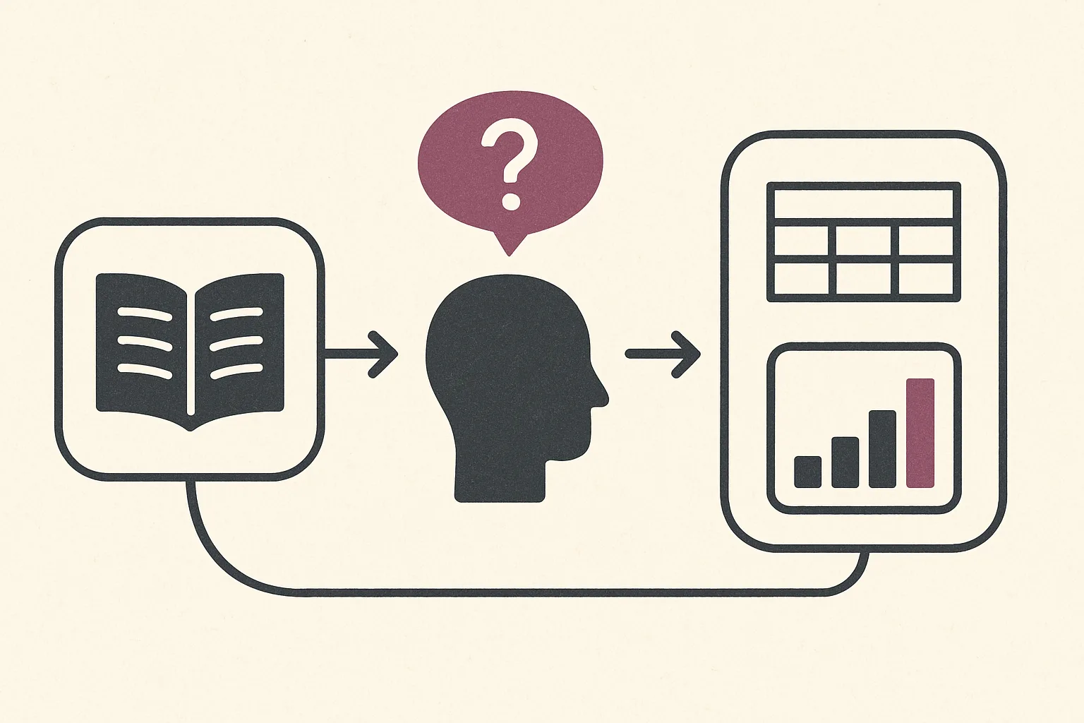
Most papers present data in two ways, and the two serve different purposes. Good practice is that they do not duplicate each other, so knowing which one you are looking at tells you what kind of reading it needs.
A table presents data in a grid of rows and columns. It usually holds numerical values, categorical labels, or both, and it is built for precise lookup and direct comparison.
Look for a descriptive title above the body, column headings, and units. The leftmost column often labels each row, and decimals are aligned so values compare easily. When you see a table, expect to pull out exact numbers that you can use to check a claim or redo a calculation.
A figure is a data visualisation: a chart, image, map, or diagram. Bar charts, histograms, scatter plots, and line graphs are the common forms.
A figure relies on axis labels, legends, and sometimes color or pattern to carry meaning, so it is built for seeing a trend, a relationship, or a distribution at a glance. As you read one, ask what single message it is designed to show.
What do captions and titles tell you?
A caption explains what the visual shows and why it matters. Note the main variable, the population, and the time frame if the caption gives them. A strong caption often states the key takeaway, and it may name the data source or a methods detail, such as the sample size behind each group.
The title signals the purpose of a table or figure and should match the study question. Check that it names the outcome and, where relevant, the comparison. If the title frames the result differently from the surrounding text, note the difference: it is often where an overstatement starts.
How do you read a table quickly?
A clear table answers who and what at a glance. Find the population in the title, caption, or header, then identify the variables listed across the rows and columns. Ask who was studied, what was measured, and under what conditions. If the population is not stated, infer it from the labels and confirm it in the methods.
Then read the column headings to learn what each column represents, and scan the rows for values. Note the unit beside each number, because a value without its unit cannot be compared.
Finally, read the footnotes. They flag data sources, exclusions, abbreviations, and statistical notes, such as which test produced a p-value. Footnotes often decide how far you can rely on a number, so read them before you quote it.
How do you read axes, legends, and error bars in a figure?
Axes and legends
Axis labels show what is measured and in which units. Start with the variable you care about, then read the other axis for context. Legends map colors, shapes, or line styles to groups or conditions. If the legend is unclear, check the caption or the paragraph that cites the figure.
Watch the scale and tick marks. A truncated axis that does not start at zero makes small differences look large, and a logarithmic scale compresses large ones.
Note any abbreviations, and check whether two related panels share the same scale before you compare them.
Color, symbols, and patterns
Color usually marks categories or intensity, so check that the legend explains each hue. Patterns such as stripes or dots do the same job when a figure is printed in grayscale. Symbols and line types separate data series: solid from dashed lines, circles from squares or triangles. Track them and you can follow each comparison without returning to the caption.
Error bars
Error bars are where many readers misread a figure. In Error bars in experimental biology, Geoff Cumming, Fiona Fidler, and David Vaux explain that the same-looking bar can show three different things: a standard deviation (SD), a standard error (SE), or a confidence interval (CI). The figure legend should say which one, and how many observations each bar is based on.
The difference matters. SD bars describe how spread out the data are. SE and CI bars describe how precisely the mean was estimated, so they are the ones that speak to whether two groups differ.
Cumming and colleagues give rules of thumb for comparing independent groups. When 95% CI bars overlap by no more than about half the length of one arm, the difference is significant at roughly p = .05. For SE bars, with samples of about 10 or more, a gap between the bars about the size of one arm suggests the same. These rules do not apply to repeated measurements on the same participants, so check the design before you use them.
If the legend does not say what the bars show, treat any visual impression of a difference as unconfirmed.
Does a significant result mean an important one?
No. Statistical significance tells you that a result would be unlikely if there were no real difference, given the test's assumptions. It does not tell you how large the difference is. The ASA statement on p-values from the American Statistical Association, written by Ronald Wasserstein and Nicole Lazar, makes the point directly: a p-value does not measure the size of an effect or the importance of a result.
So when a table reports a p-value, look beside it for the effect size and its confidence interval. A tiny difference can be significant in a very large sample, and a large difference can miss significance in a small one. The interval tells you the range of effects the data are consistent with, which is usually what you need to decide whether the result matters for your question.
How do you check a figure against the text?
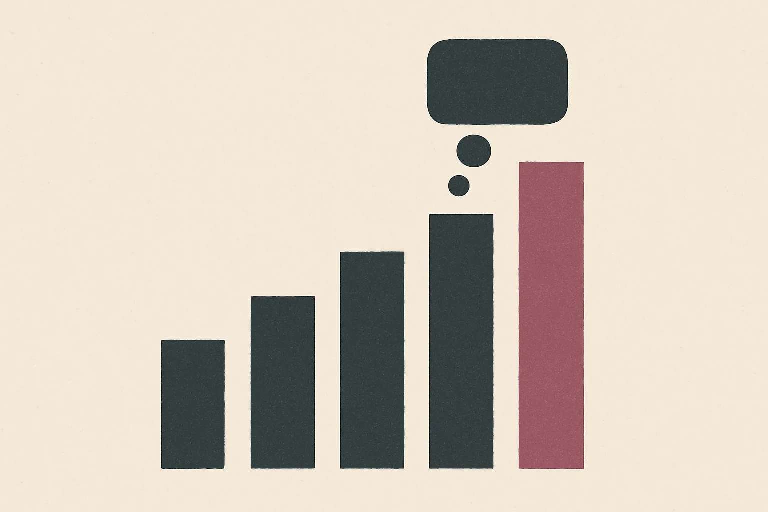
The results text gives context a visual cannot. Find the sentence that states each main finding and the figure or table it cites, then trace the specific numbers or patterns from the sentence to the visual. When the text describes a change over time, check the axis for its direction and size.
Then cross check the population, conditions, and units named in the prose against those in the visual. Pay attention to how the authors frame significance, causality, and limitations, because that framing shapes how you read the data. If a claim reaches beyond what the figure shows, the figure wins. For the steps behind each number, read it alongside our guide on how to read the methods section without getting lost.
What questions should you ask before accepting a table's conclusions?
A good figure or table should stand on its own: a clear title, readable labels, complete units, and a legend that matches the categories named in the caption. Before you accept what it concludes, ask:
- Who is in the sample, and how many observations sit behind each value?
- Are the units and scales consistent across related tables and figures?
- What do the error bars or intervals show, and how large is the effect, not only its p-value?
- Does the caption describe results, or does it only restate the methods?
- Is anything packed so densely that a comparison is hard to see, or left out entirely?
If a question has no answer in the visual, the caption, or the footnotes, note it as an open question rather than filling the gap yourself.
How do you annotate and connect figures across a paper?
When you reach a figure or table, mark the most important values and write a short note on what they imply. Use the same symbol for the same idea across visuals: for example, circle the primary outcome and underline any threshold that signals a notable change. Consistent marks prevent misreadings when you review the paper later.
Then compare related figures and tables. Look for converging trends, conflicting results, and how each visual supports or challenges a claim in the text. Write one line per cluster that states what the visuals show together, and note which section of the text discusses each one. This is the habit that builds reading comprehension across a field, not only within one paper.
In Omphalis, a paper opens with a section map, so you can move between a result, the figure it cites, and the methods behind it without losing your place. The moments you mark keep their notes and reopen the exact passage they came from. When you ask a question about the paper, the answer cites the passage it relies on, which makes it easier to check a claim against the data. Omphalis also has a page on reading research papers.
Frequently asked questions
What can a figure show that the surrounding text does not?
A figure shows the shape of the data: the spread, the outliers, the trend over time, and how much groups overlap. Text usually reports a summary, such as a mean or a p-value. The figure lets you see whether that summary describes the data well.
Should a table and a figure repeat the same data?
Usually not. Tables suit dense, exact values and figures suit trends and relationships. When the same data appear in both, check that the numbers agree, because a mismatch is a sign of an error.
Where do titles and captions go?
Common style guides put a table's title above the table and a figure's caption below the figure. Both are numbered in the order they are cited in the text.
What should you check when you only have a minute?
Read the caption, the axis labels and units, and the legend, including what the error bars show. Then confirm that the population and variables match the claim you care about.
Why should a figure not rely on color alone?
Color disappears in grayscale prints and is hard to read for people with color vision deficiency. Patterns, markers, and direct labels keep the comparison readable in both cases.
References
- Figures and Charts - The Writing Center
- Formatting tables and figures in your research paper
- 3.4 Figures and Tables – Technical Writing Essentials
- How to clearly articulate results and construct tables and figures in a scientific paper - PMC
- Error bars in experimental biology (Cumming, Fidler and Vaux, 2007)
- The ASA statement on p-values (Wasserstein and Lazar, 2016)